Shift
Branding
2019
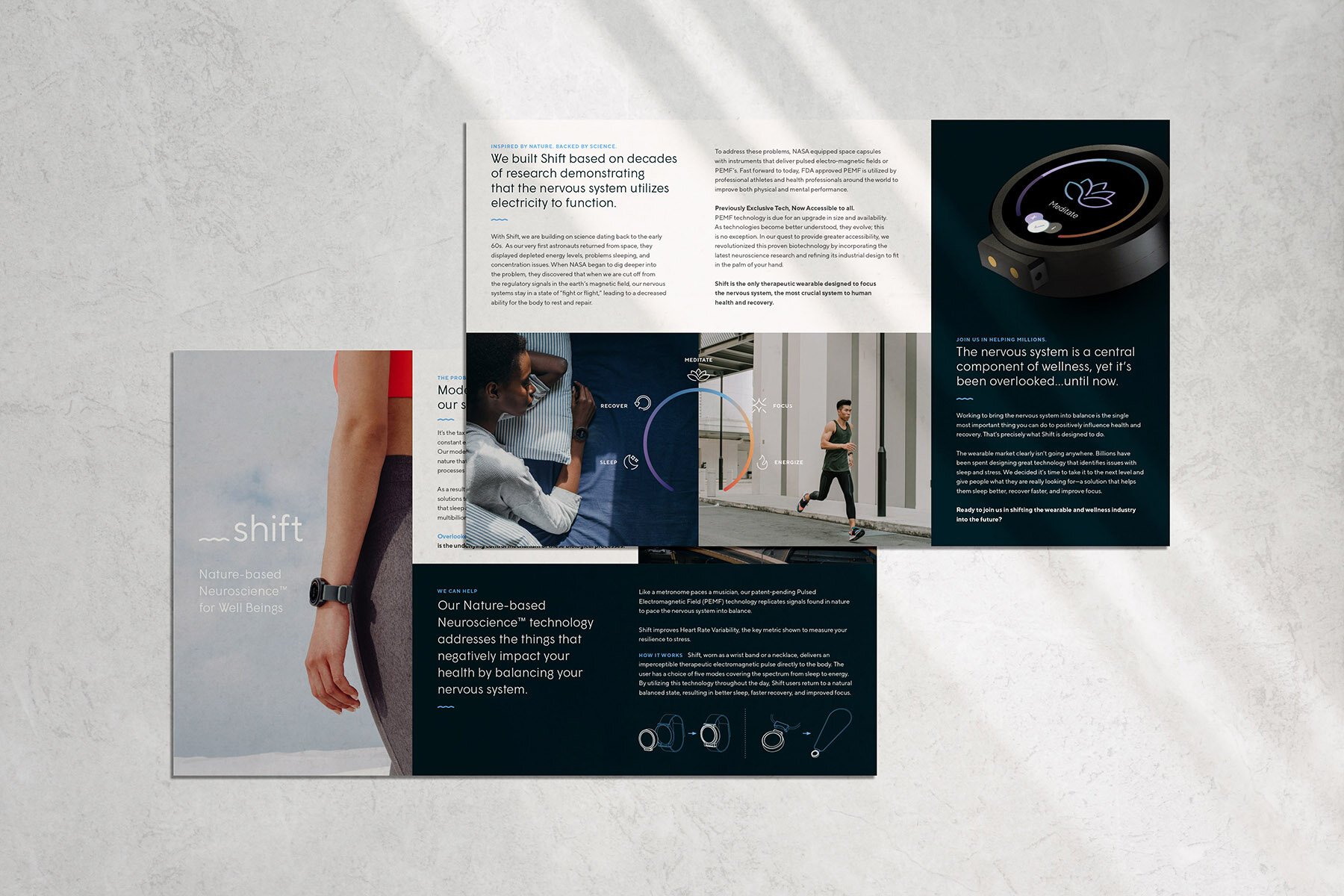
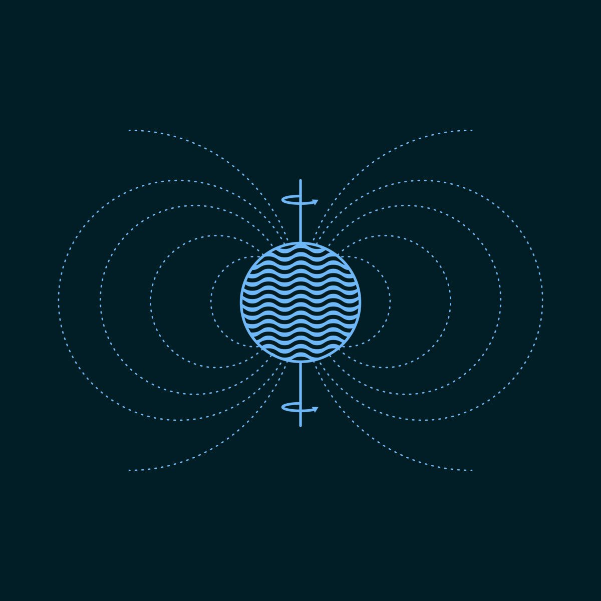
Like a metronome paces a musician, Shift is a wearable device that emits Pulsed Electromagnetic Field (PEMF) signals — harnessing the power of nature and neuroscience to rebalance your nervous system.
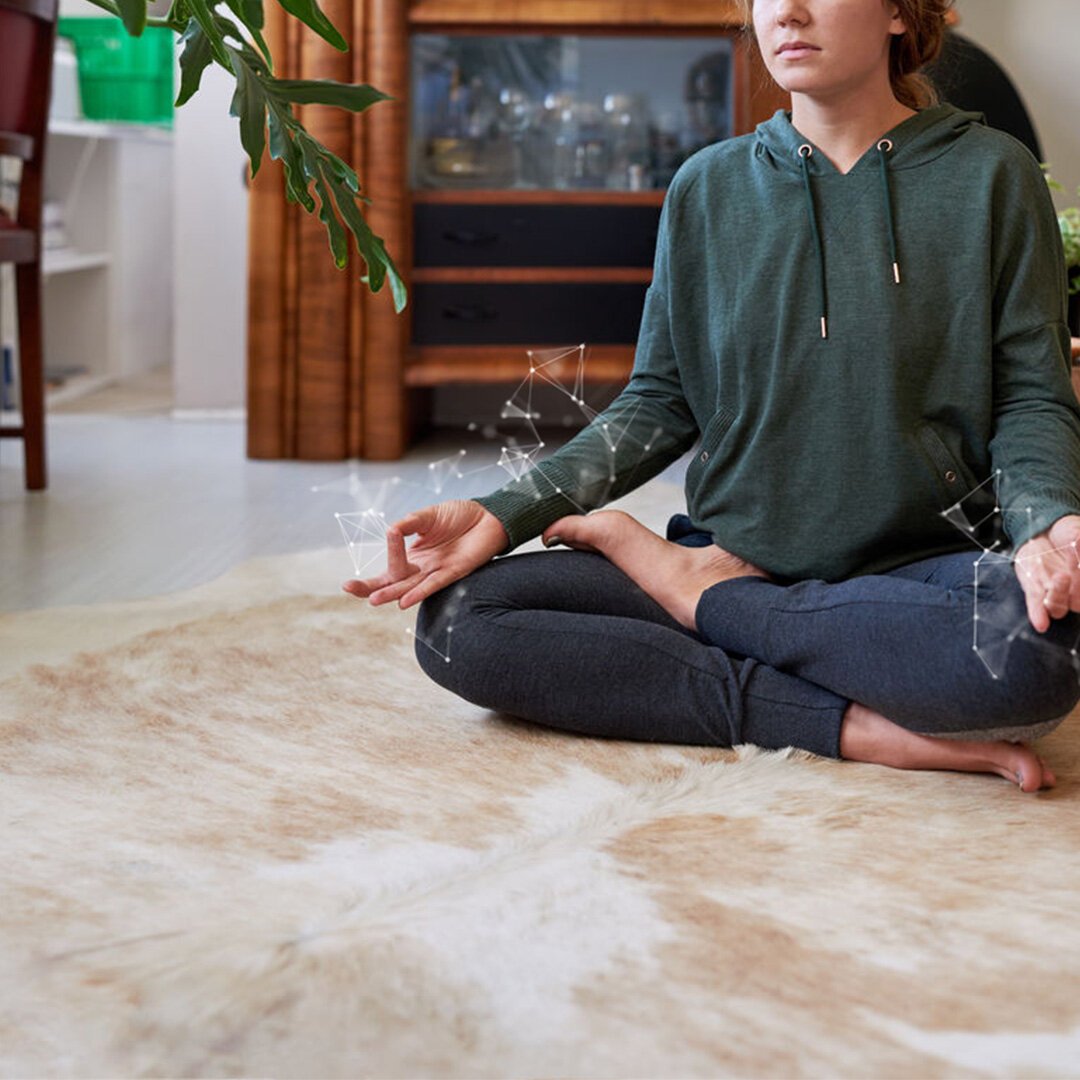
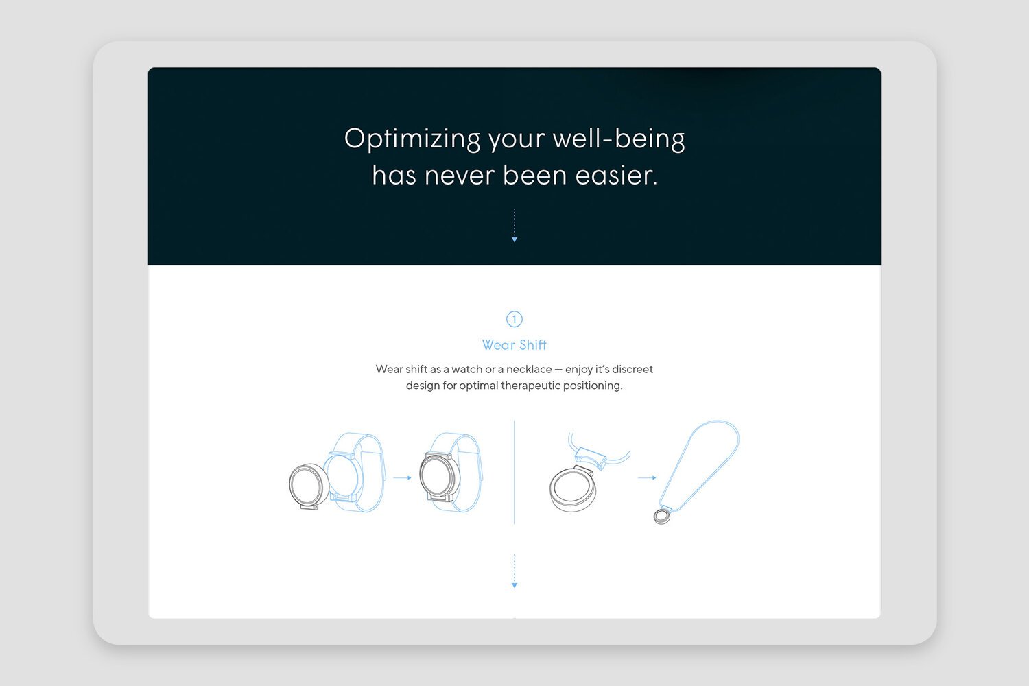
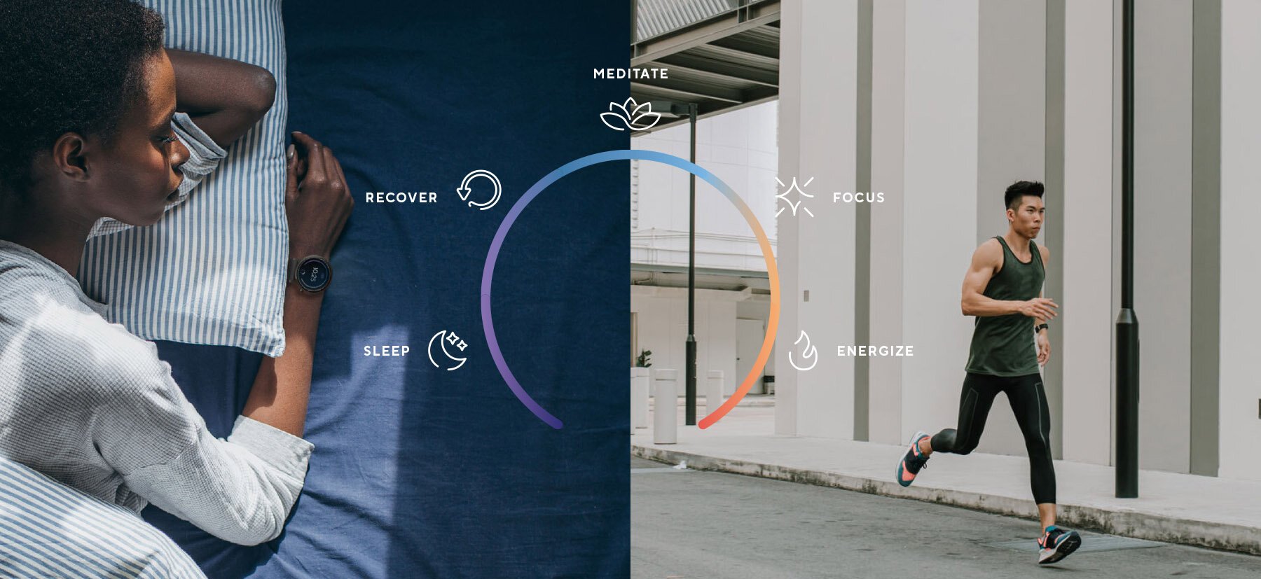
Shift offers a new wearable technology that relies on age-old science — utilizing Pulsed Electromagnetic Field technology to help regulate our bodies’ nervous systems. The device can be worn as a watch or as a necklace, and can be set to one of five states — helping the user shift down for stress-reduction, recovery, and sleep, or shift up for heightened focus and energy.
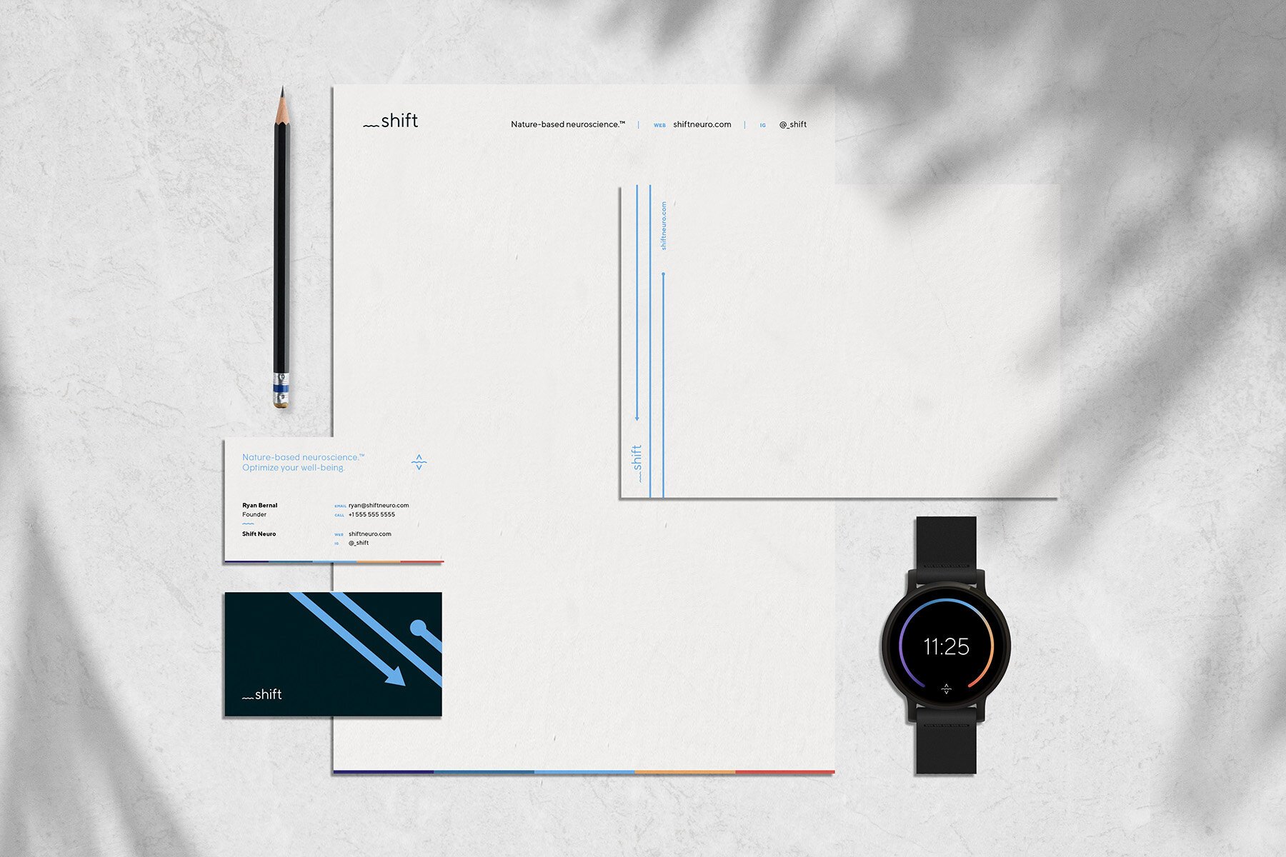
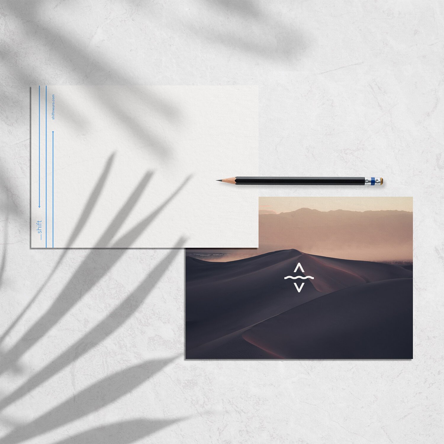
The visual identity creates an image of a clean, minimal, and wellness-focused brand with a focus on nature and simple, aspirational lifestyle imagery of real people using the product. The logo and icon are simple, allowing the strong photography, color palette and corresponding user interface design, typographic system, and other graphical elements and icons to really come through and showcase the brand’s benefits.


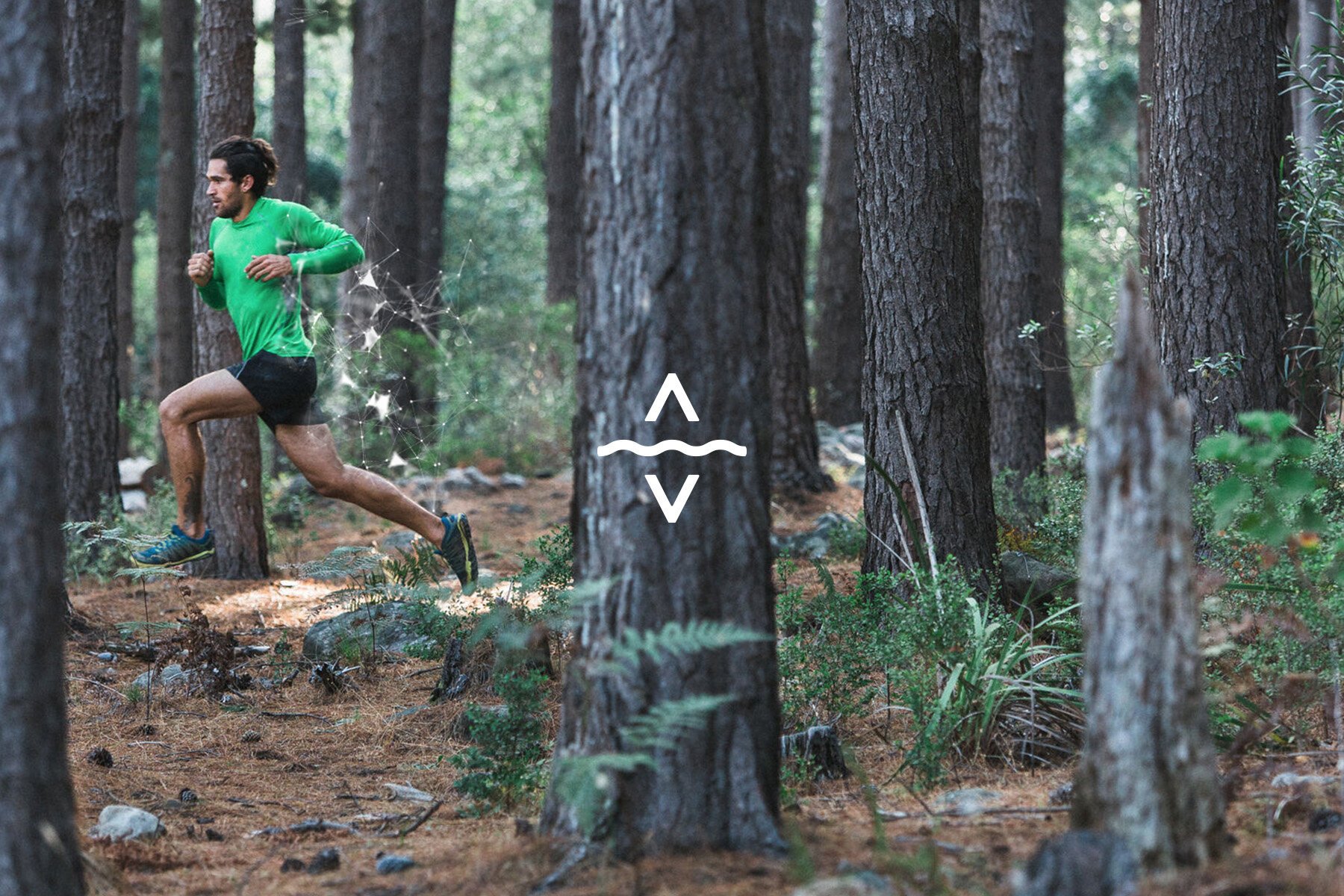
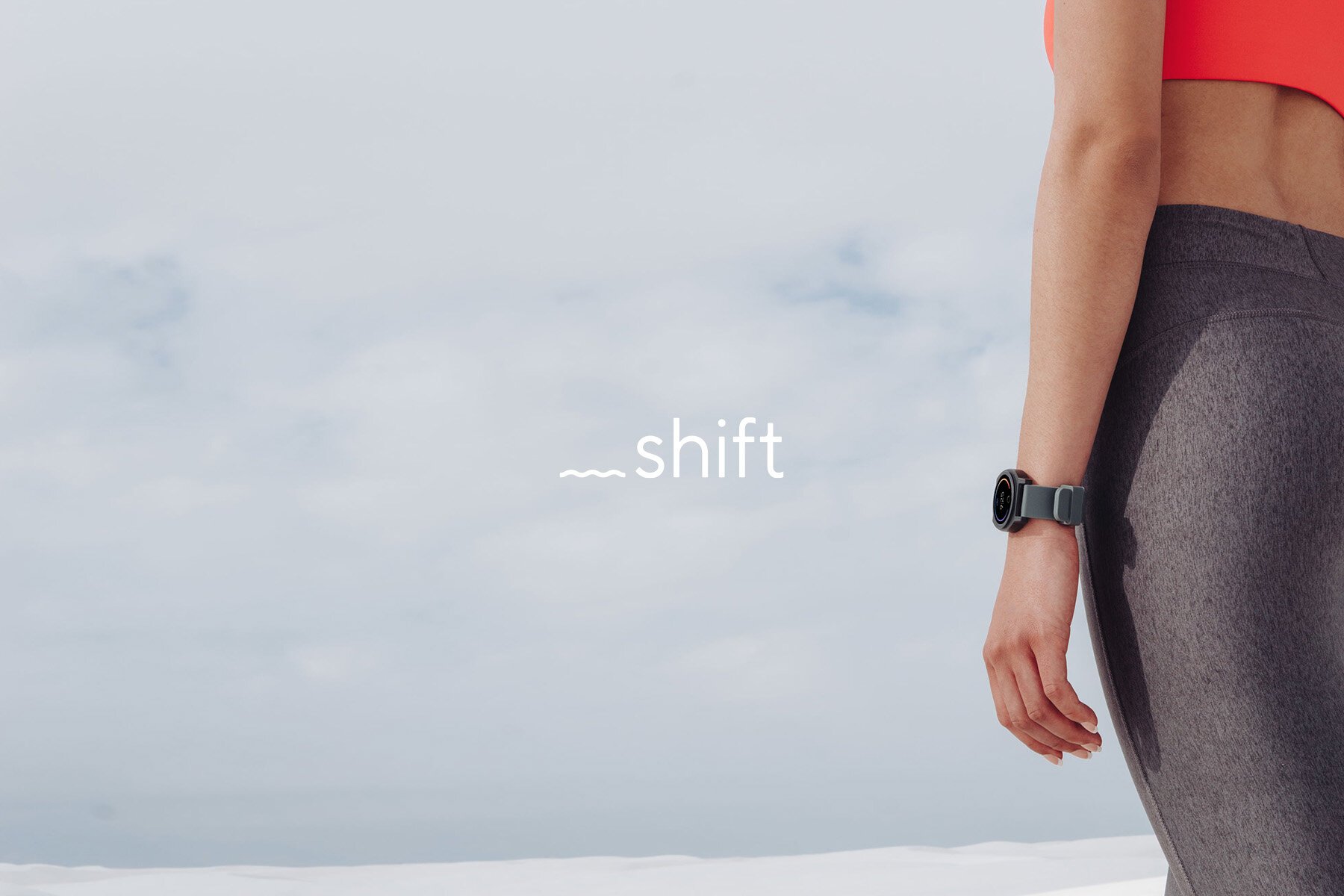
The logo uses a wavy underscore line that leads in front of a custom logotype — indicating emphasis and action of shifting from one state to another, as well as a literal image of nature’s electrical wavelengths.
This translates to an icon for the brand with the wave line in the center, and up and down arrows on the top and bottom that indicate the product is for shifting both up and down in energy states.
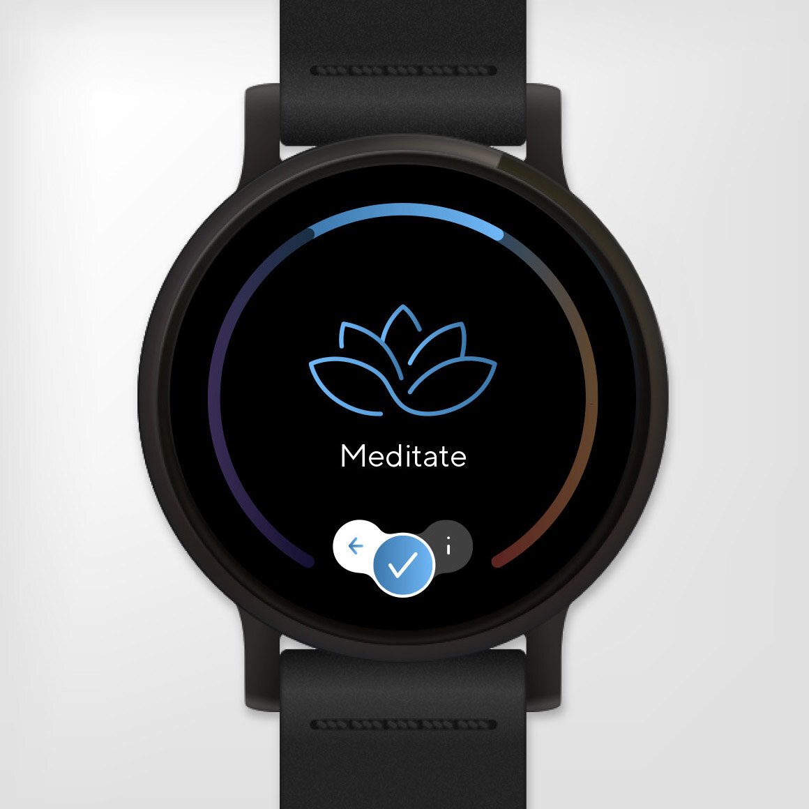
The wearable device’s user interface design features a ring of five gradient zones — each representing one of the five states that the product’s waves can shift to, from Sleep to Energize.


The visual identity system uses custom icon sets specific to the user interface and to the marketing and brand collateral. In the marketing iconography, the wavy line creates a negative space texture that builds a natural flow symbology into all of the icons in the system.
Textural or background images feature graphic patterns with chasing lines that indicate moving from one state to another, or general macro photography of nature to represent the product’s focus on a return to natural balance.
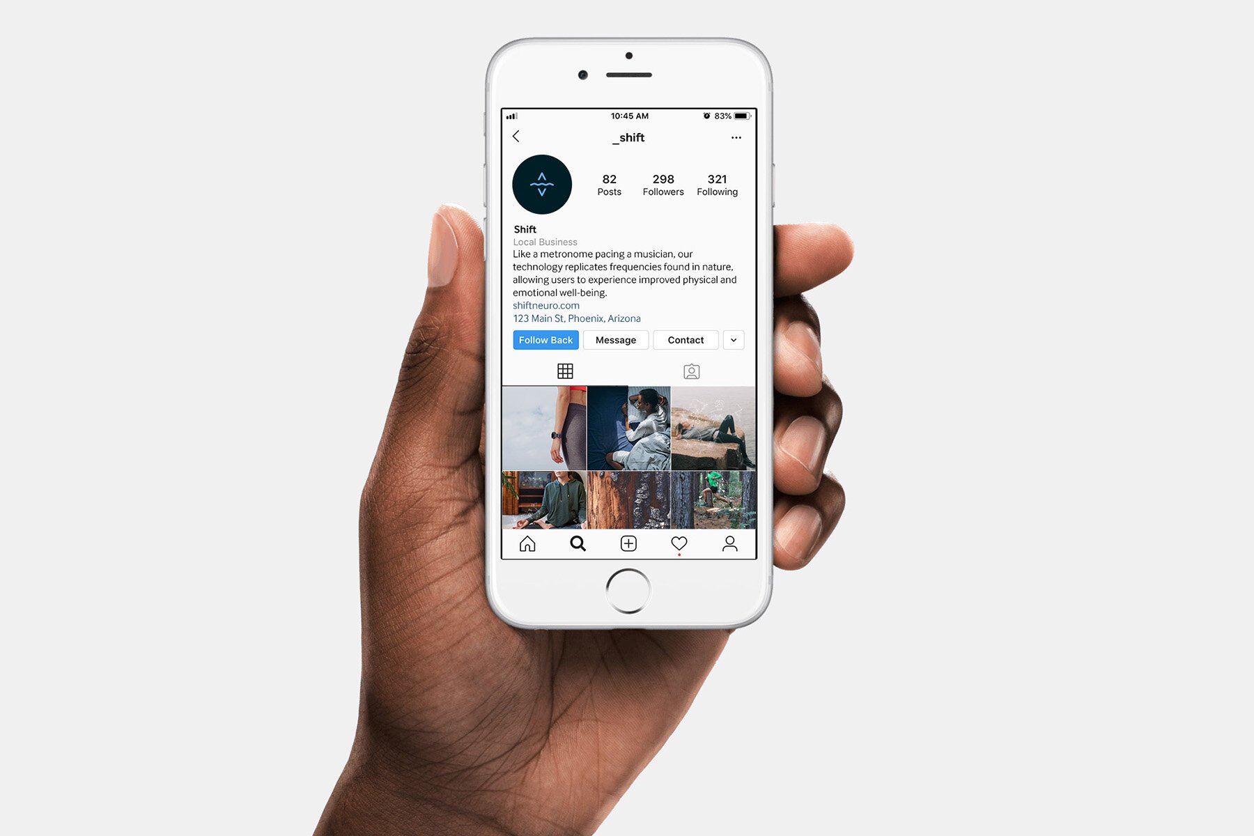
Brand imagery relies heavily on clean and clear product photos that showcase the beautiful design, as well as aspirational lifestyle imagery showing real people engaging in all five stress-reducing or active states of the product on minimal backdrops allowing the action and people to really shine.