
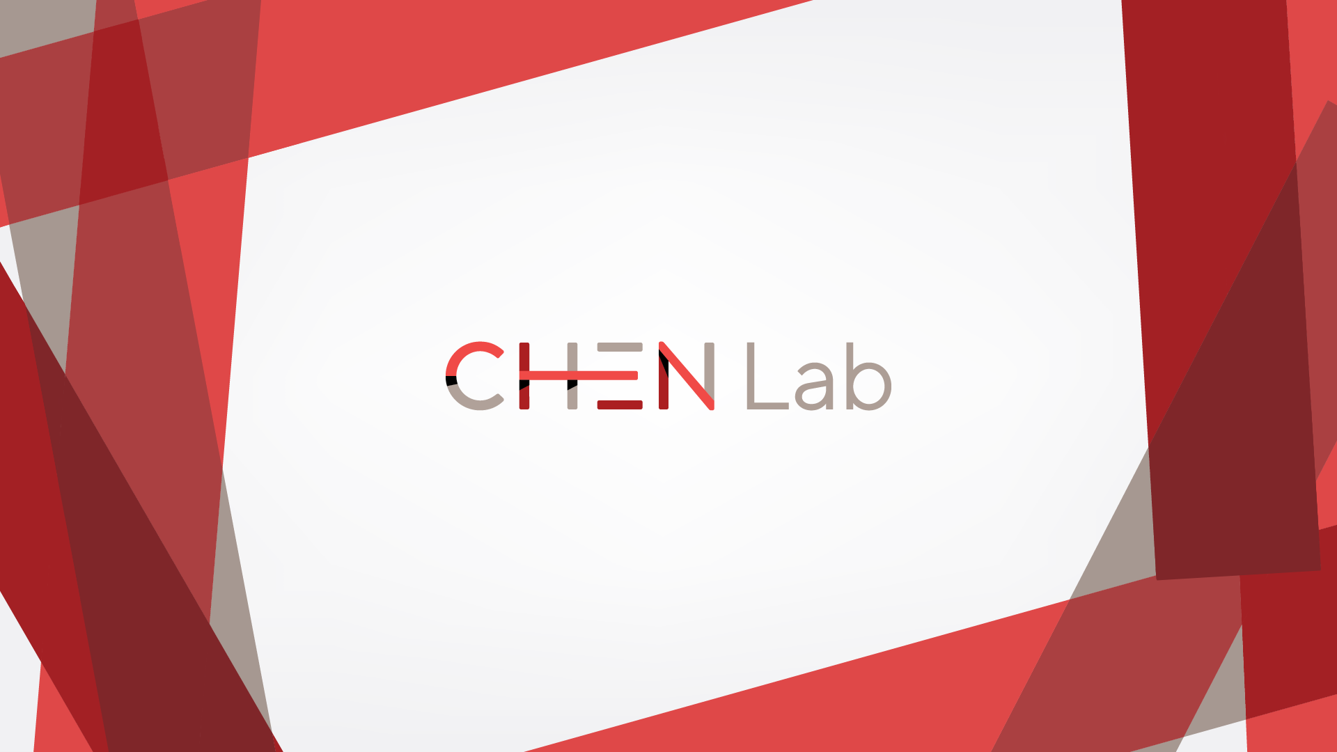
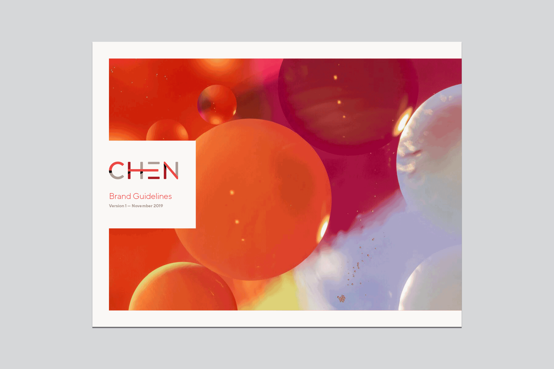
Chen Lab
Branding, messaging, Guidelines
2019
Discovering Solutions. Transforming Communities.
Chen Lab focuses on transparent research — finding cures and solutions to the complex problems of the day while opening our doors to the community and inviting them along in the process.
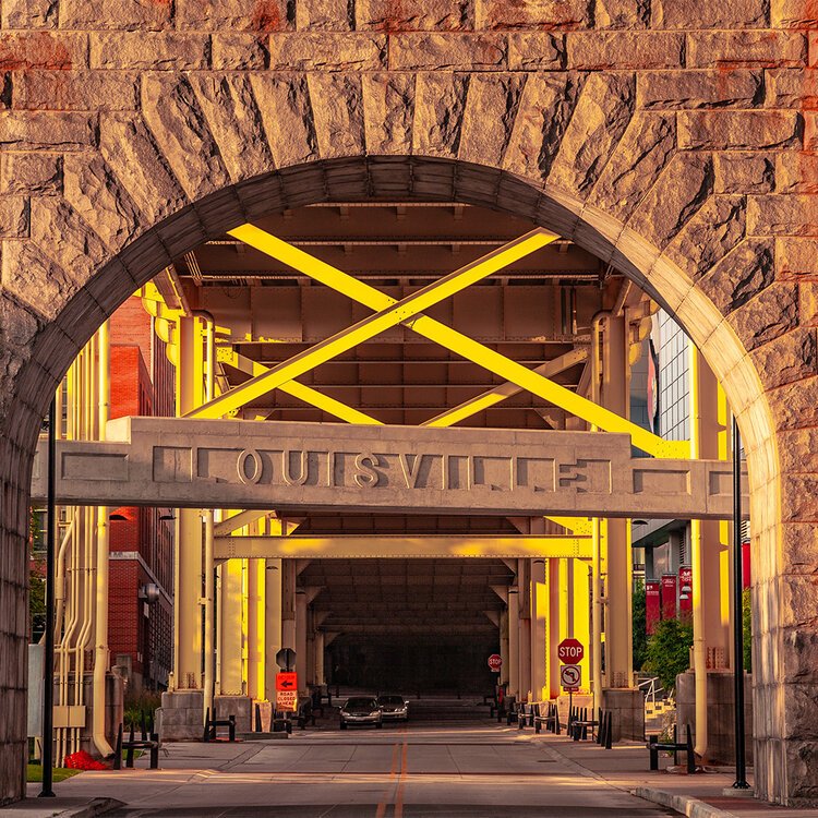
Chen Lab operates as a cutting-edge research laboratory based in Louisville, Kentucky and in conjunction with the University of Louisville.
What sets them apart is their commitment to investing time and energy into sharing their research and work with their community, bridging the gap between researchers and laypeople so that the work can be translated into common understanding. This is what they call transparent research, and it is what makes them who they are.
Together with the lab’s founder, Joseph Chen, we crafted a visual identity from the ground up that introduces the brand to its community in an engaging way.


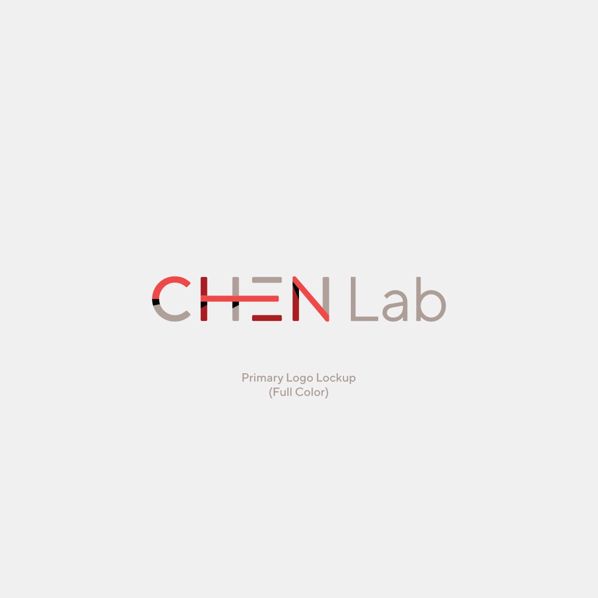
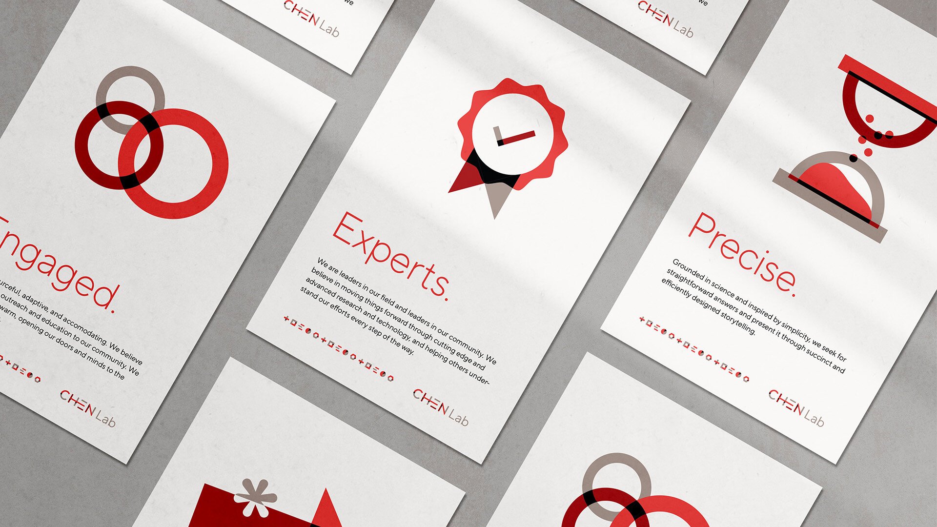
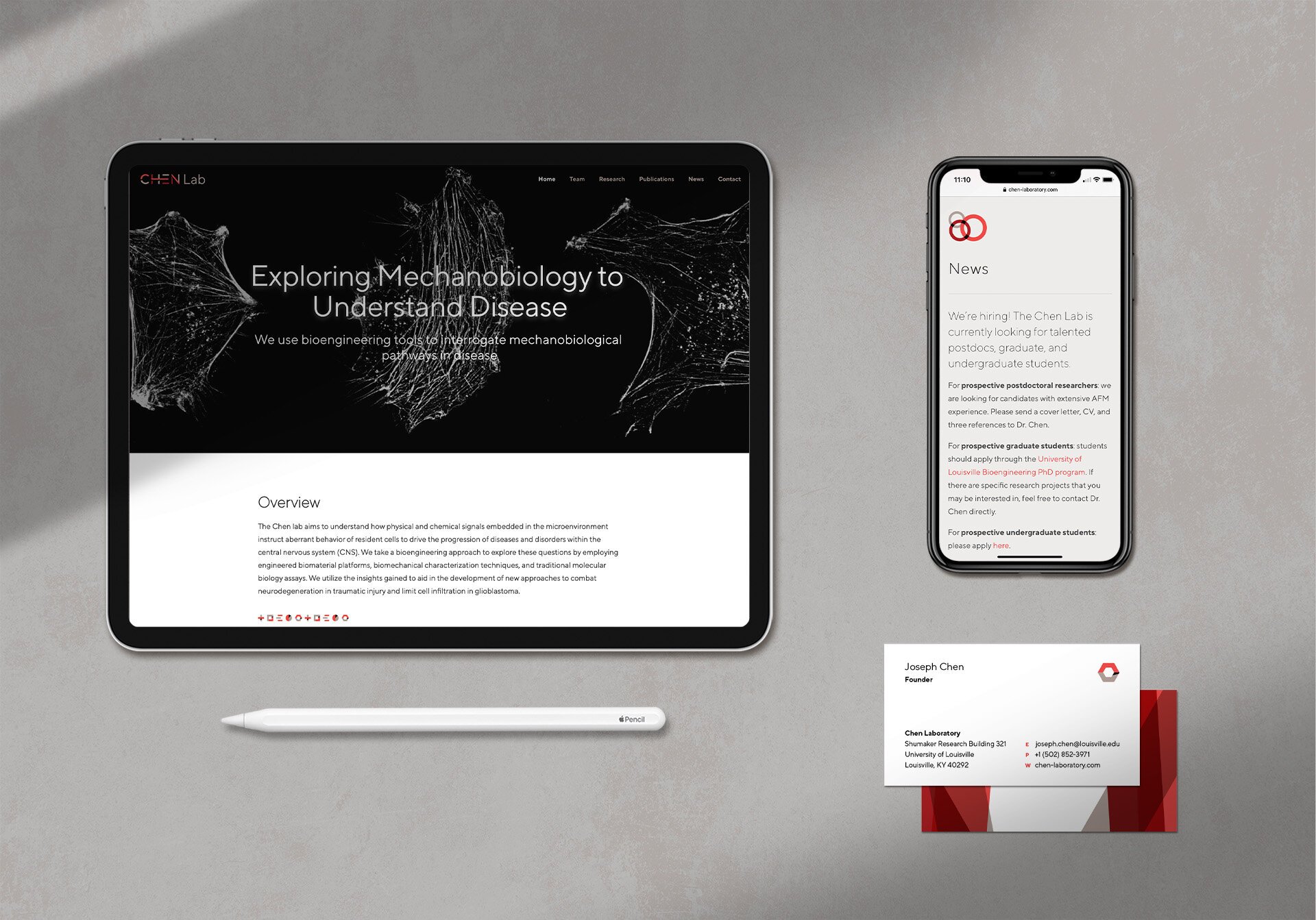
The Chen Lab logo is the primary representation of our brand across the visual identity system. The logo incorporates weaving shapes and lines that spell out the name, and appear as if they are creating stacks and layers on top of each other.
The color palette uses the University of Louisville’s core red color, combined with two accent colors that are special to Chen Lab, creating a palette that complements the university as a backdrop while also being unique as its own entity.

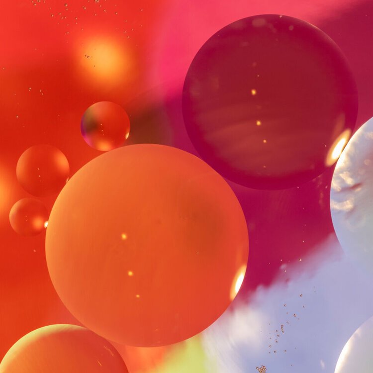
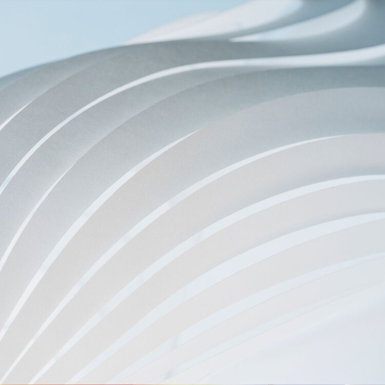
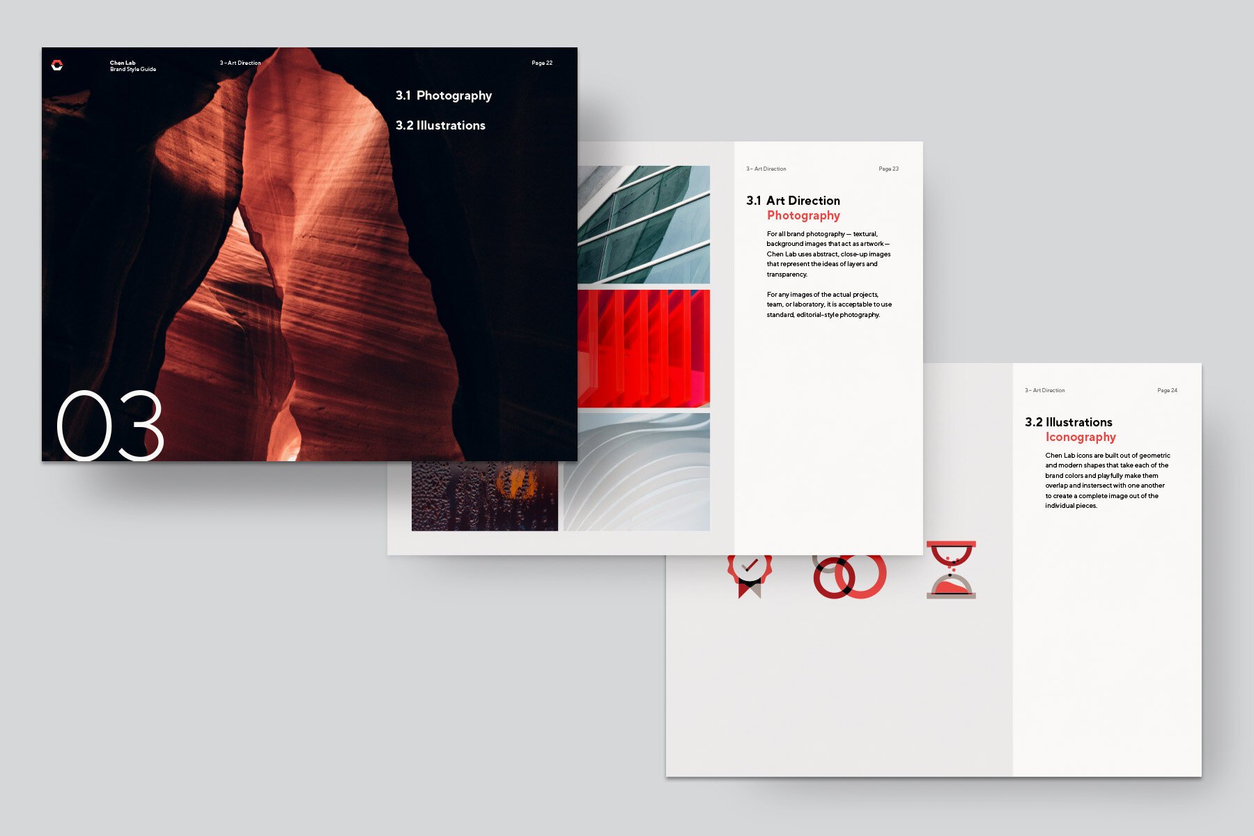
The idea of transparency and stacking layers carries through to the brand’s overall art direction as well.
For all brand photography — textural, background images that act as artwork — Chen Lab uses abstract, close-up images that represent the ideas of layers and transparency.
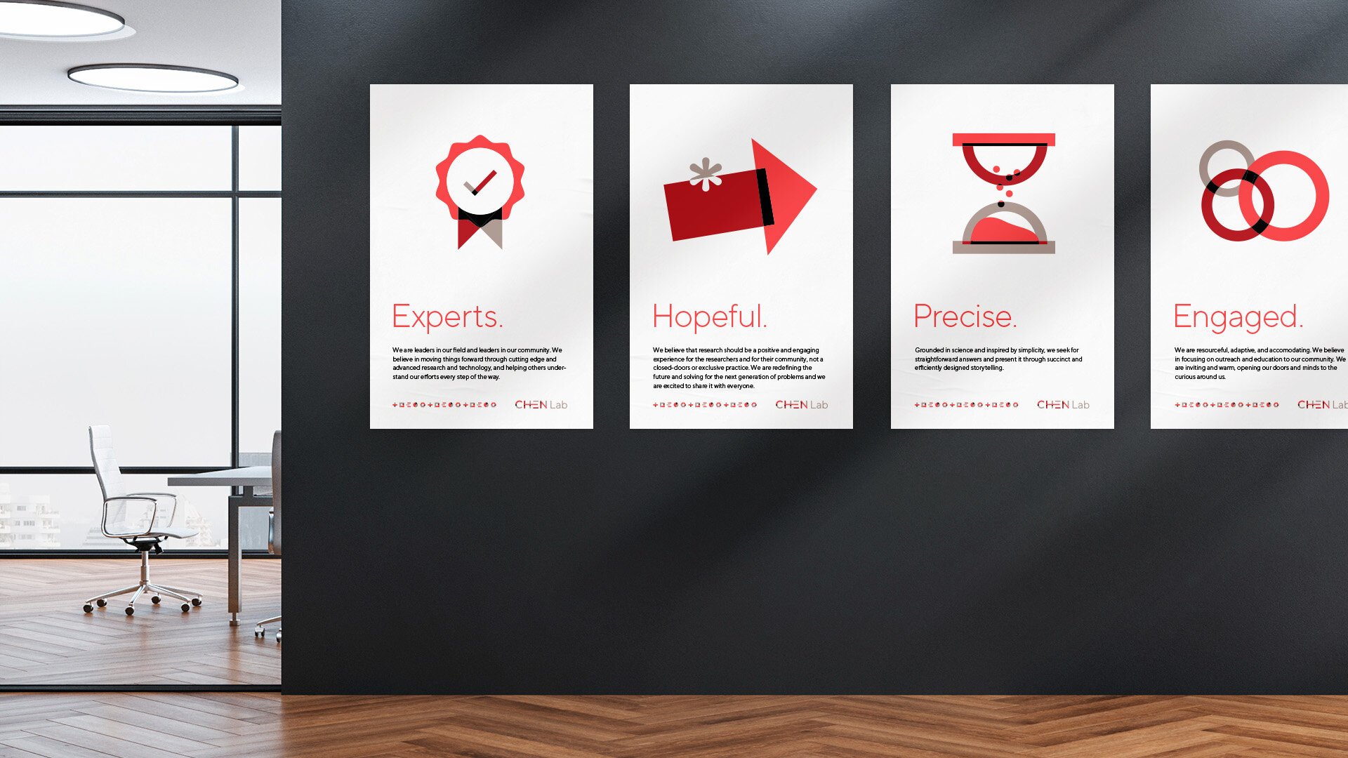
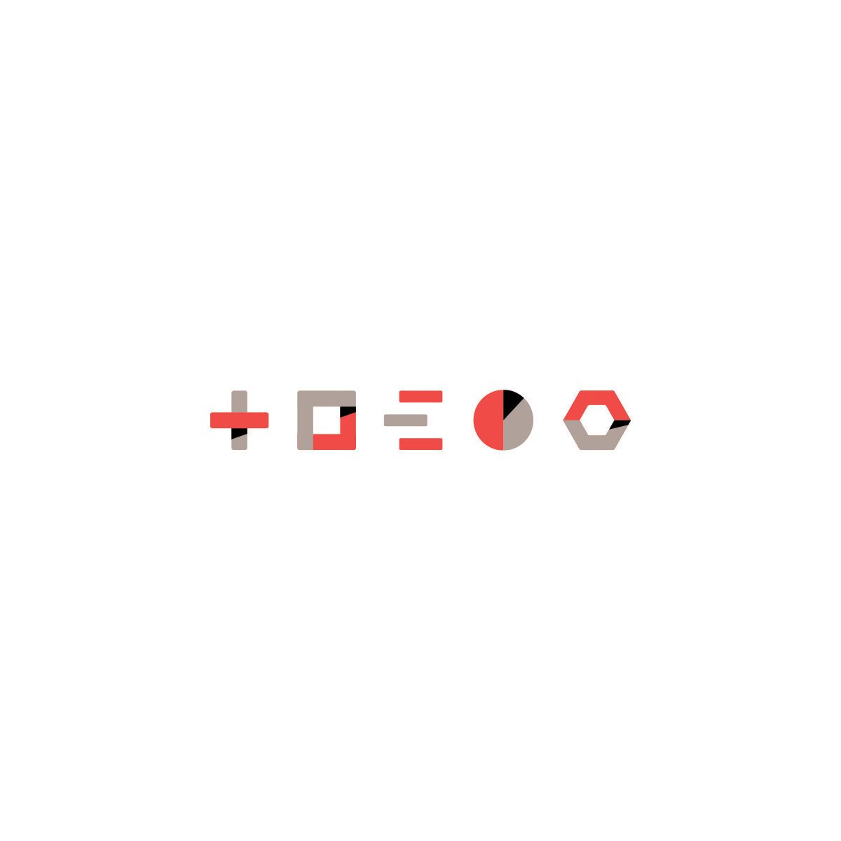
Chen Lab icons are built out of geometric and modern shapes that take each of the brand colors and playfully make them overlap and intersect with one another to create a complete image out of the individual pieces.
Chen Lab uses large-scale, blown-up solid shapes that create stacking, overlapping background textures for dramatic effect.


New York Magazine Vacations
Illustration
Lumena
Branding, Guidelines
