ShootProof
Creative Direction, Guidelines, Web, Environmental
2016
In 2016, I was brought in as the Art Director for ShootProof, a startup in Atlanta that provides client photo galleries and sales tools to photographers.
My role was to lead the creative team and design marketing collateral, as well as write and launch the company’s first brand standards document. I worked with the executive team and marketing directors on visual design projects, campaign launch creative, advertising, and promotional assets for events and exhibitions. I also worked as a mentor for the existing design team and helped in hiring for its growth.
Below are a few select projects designed over the year.
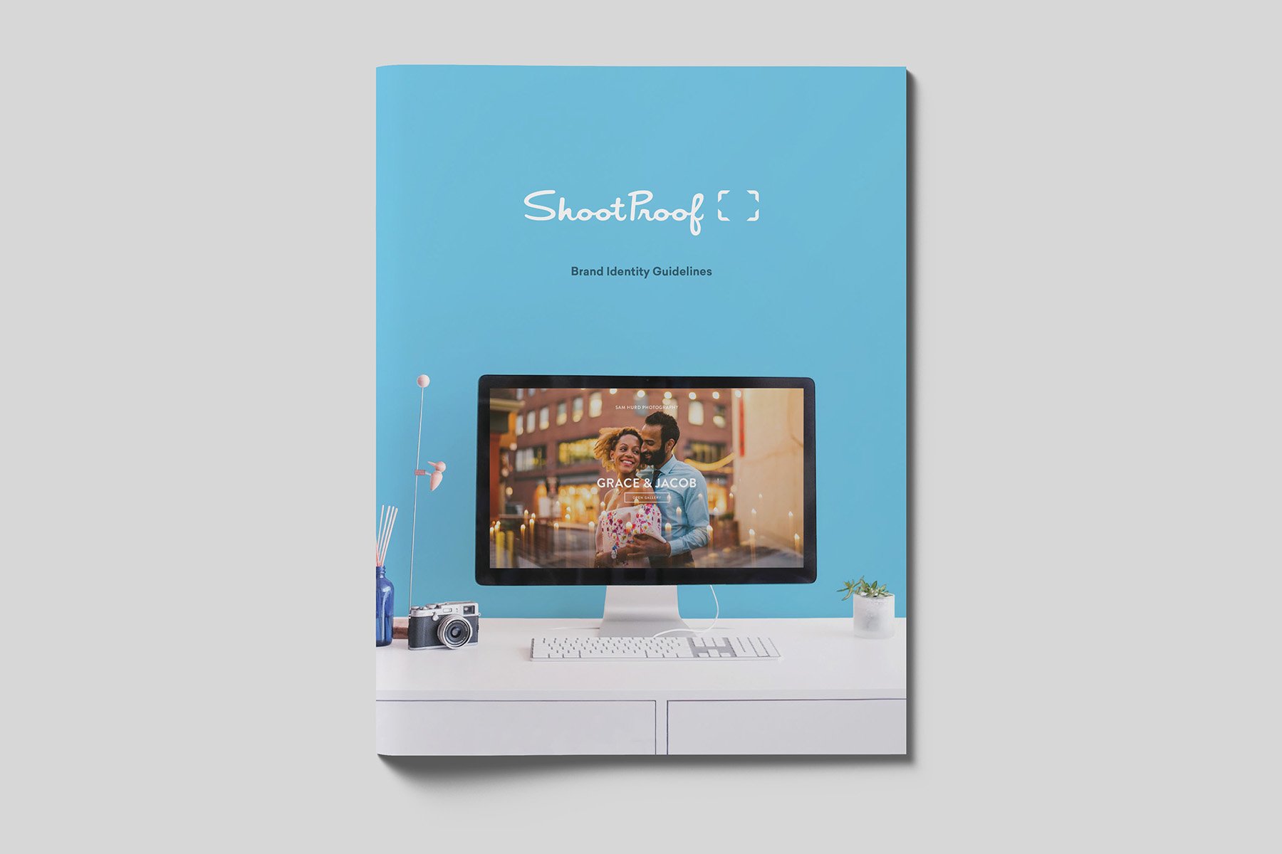
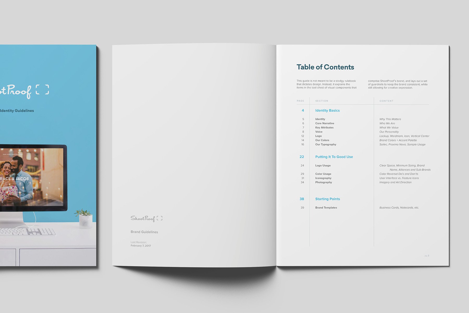
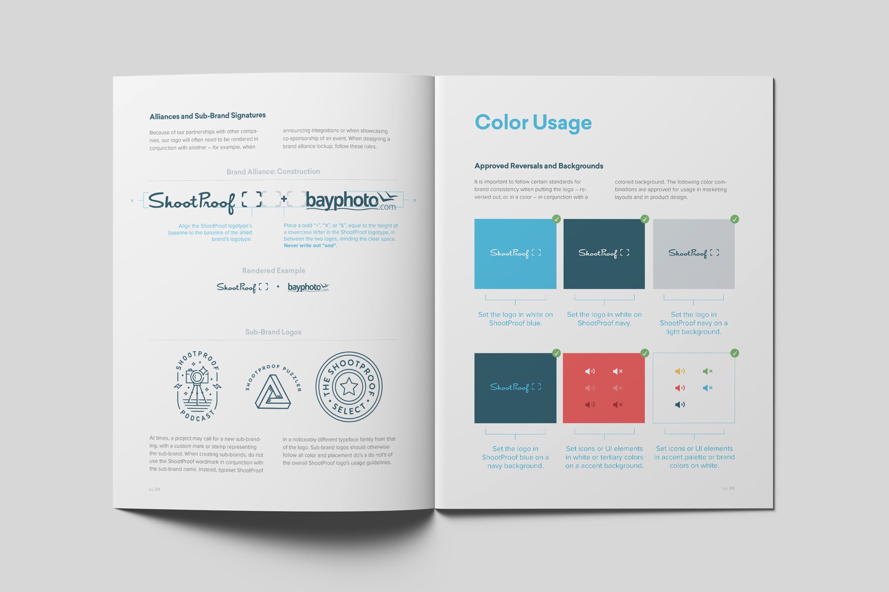
Brand Guidelines
ShootProof had a nice set of foundational brand elements — from a logo that stood out from competitors, a strong user interface design for its product, and a great voice and tone in writing — but guidelines were needed around the brand so that it could build upon these elements over time and as the team changed and grew.
Working with the co-founders, I developed the company’s first brand identity guidelines and style guide document. This 39-page booklet serves as a jumping off point for all future creative work, with sections that educate employees on the brand’s core narrative and key attributes, voice and tone, and visual decisions such as a unified color palette, typography system, guidelines around color usage and photography usage, and more.


“See How ShootProof Works” Video Advertising
ShootProof has a lot of product offerings and features to help make photographers’ lives and workflows easier, but it needed a simple explanation to help attract prospective photographers to sign up. Working with the creative team for this project, I helped concept, storyboard, and art direct a video advertisement campaign that we placed on Instagram and on the web through targeted landing pages. This video exceeded expectations and directly drove 8000+ accounts created.
Press play below!
Creative team: Michael Knowlton, Kristie Feltner, Cassia Reynolds, Russell Shaw
Stills


Print Advertising
For a full-spread advertisement in Shutter magazine, I worked with the marketing lead to develop a concept which utilized the spine in the center of the spread to show two different photographers’ working lives: on the left, a messy desk and an even messier desktop with copy that read “Running a photography business is tough.” This empathizes with the viewer and paints a picture of how hectic it is to own your own business. On the right, the desktop is streamlined and clean with ShootProof’s interface pulled up, highlighted by the cleaner desk, and the simple message, “ShootProof simplifies everything.”

Marketing Site Concepts
Over the year, I worked closely with the user interface designers, user experience designers, and engineering team to develop and test several new pages on the marketing site. This included explorations around new feature page concepts, alternate pricing page models for A/B testing, and creative landing pages for targeted ads.
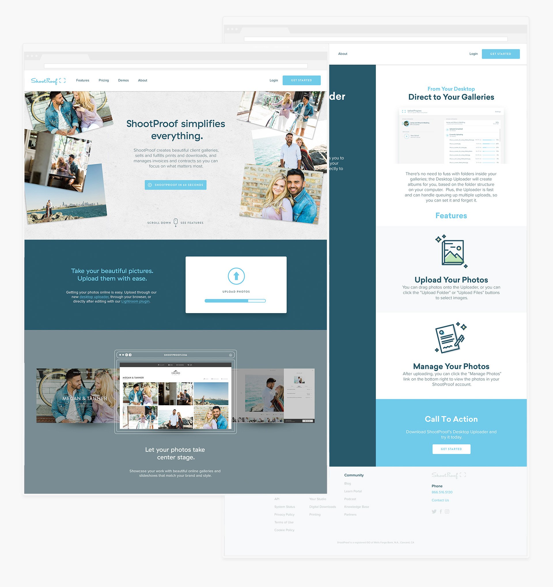
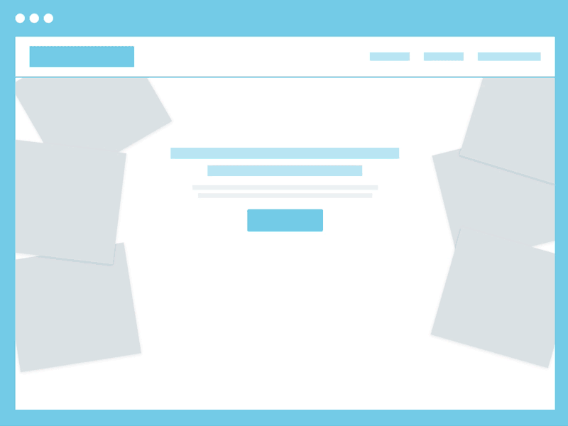
Features Overview Page Concept, and Deep Features Pages
As the user scrolls down the Features page, the photos from the hero area collapse into the Desktop Uploader funnel, and then re-appear from it and into the ShootProof gallery in the product interface below it.
The photos would then continue moving through the features page as the user scrolls, showing the journey of taking a photo, getting it into the product, and ultimately selling it to a Client as digital and physical prints.
I worked on this concept with Chad Bercea who designed the page abstractions and animation!
Once the user clicks any one of the text links to learn more about a specific feature from the overview page, they are taken to a split-screen “deep feature page” which highlights the feature, a video explanation of how to use it, and a scrollable area to learn more about its key features and information.

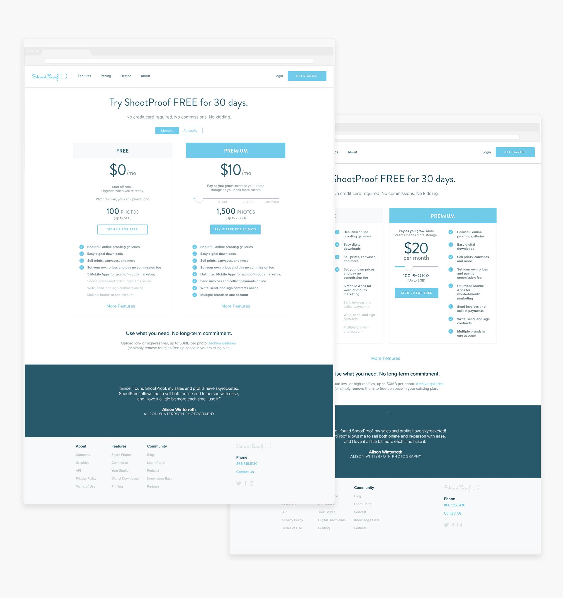
Pricing Page Redesign A/B Testing


Custom Landing Pages, Art Direction and Concepts

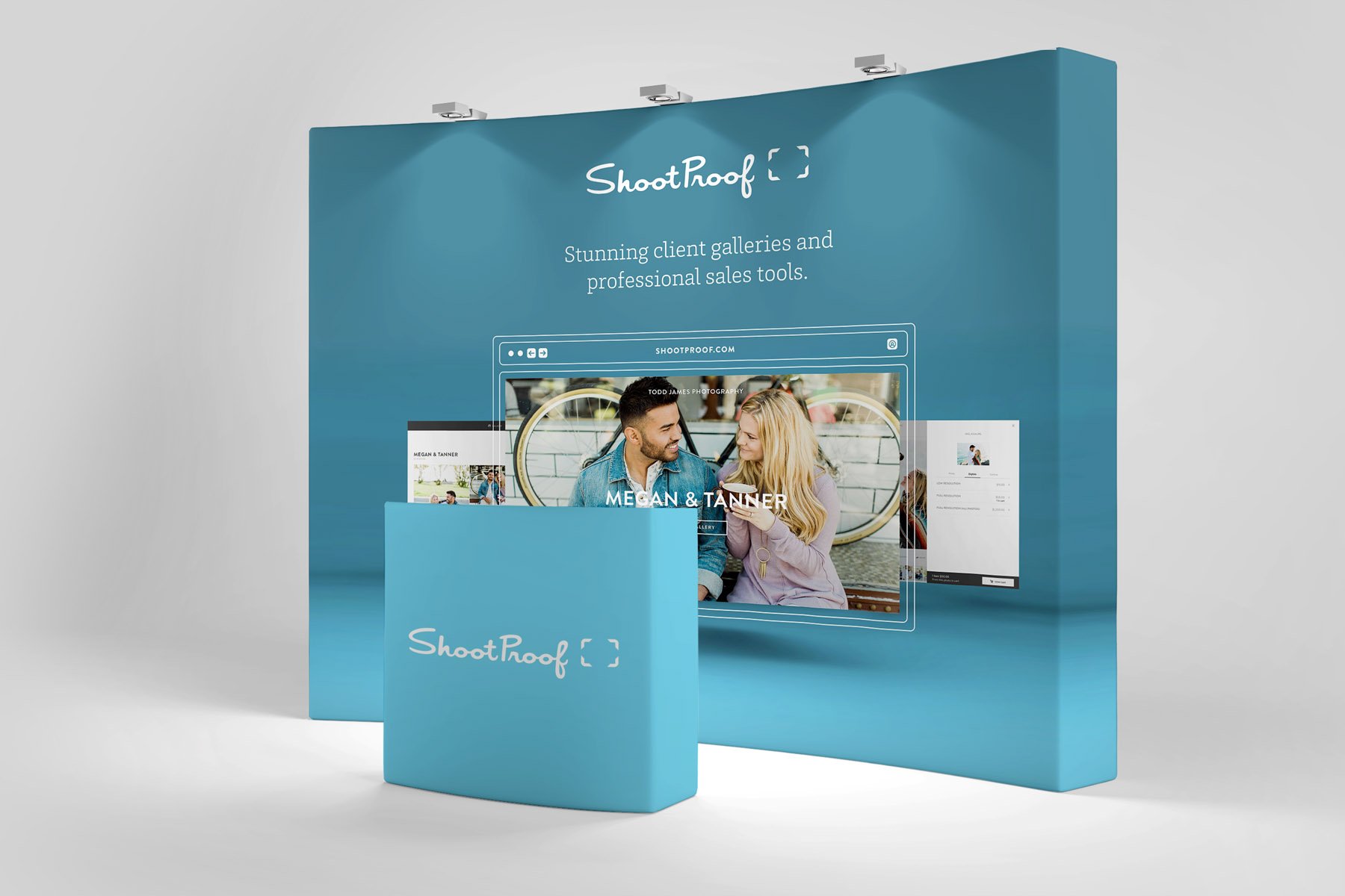
Trade Show Booth Design
ShootProof attends many industry events and expositions, and in addition to the printed collateral that was to be distributed to conference-goers, we needed a booth design that was attention-getting. I designed this large, flare wall booth to show off the clean design of a ShootProof client gallery. In front of and around the booth, computers were set up for live demonstrations.